The Hampshire Coffee Festival
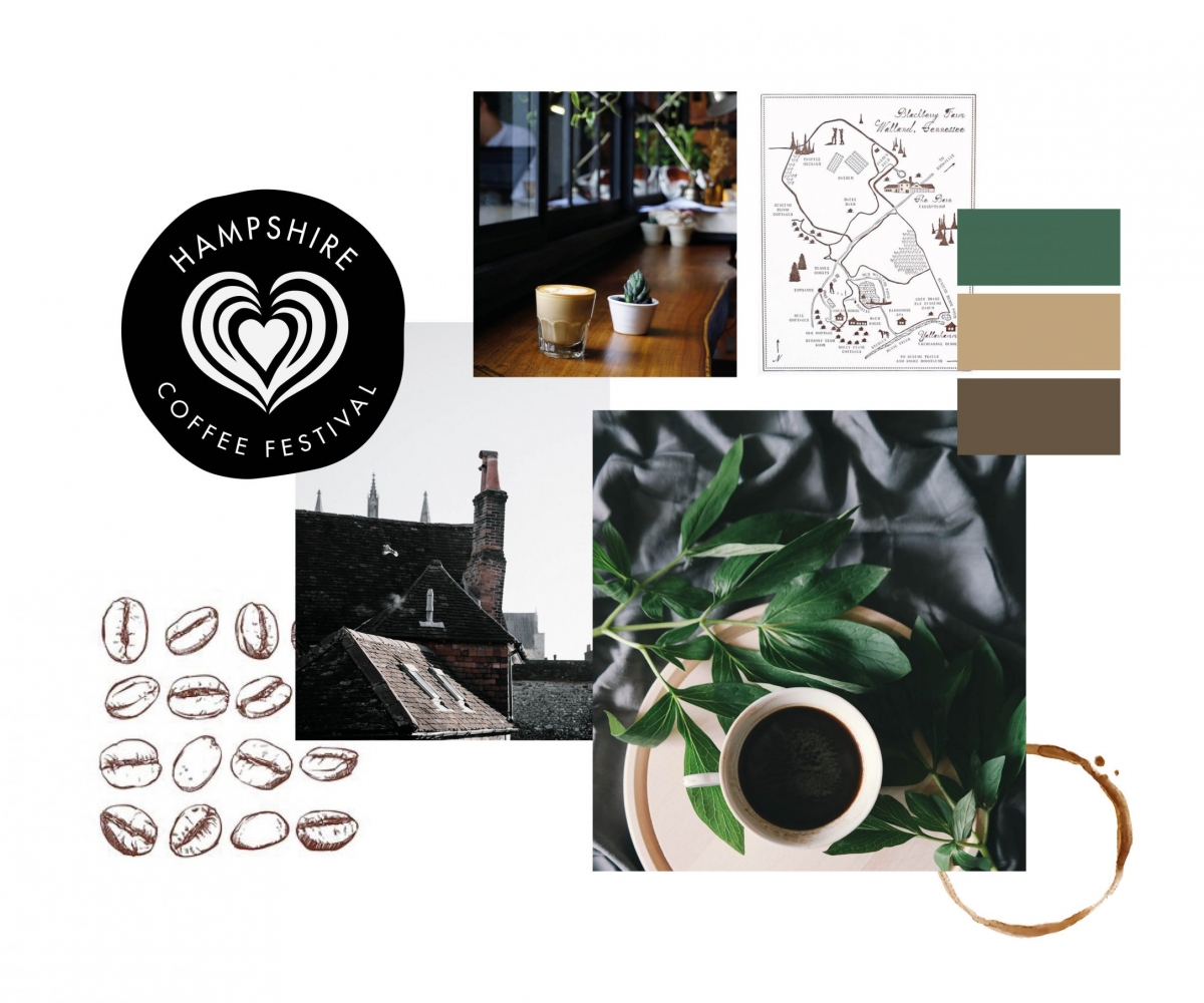
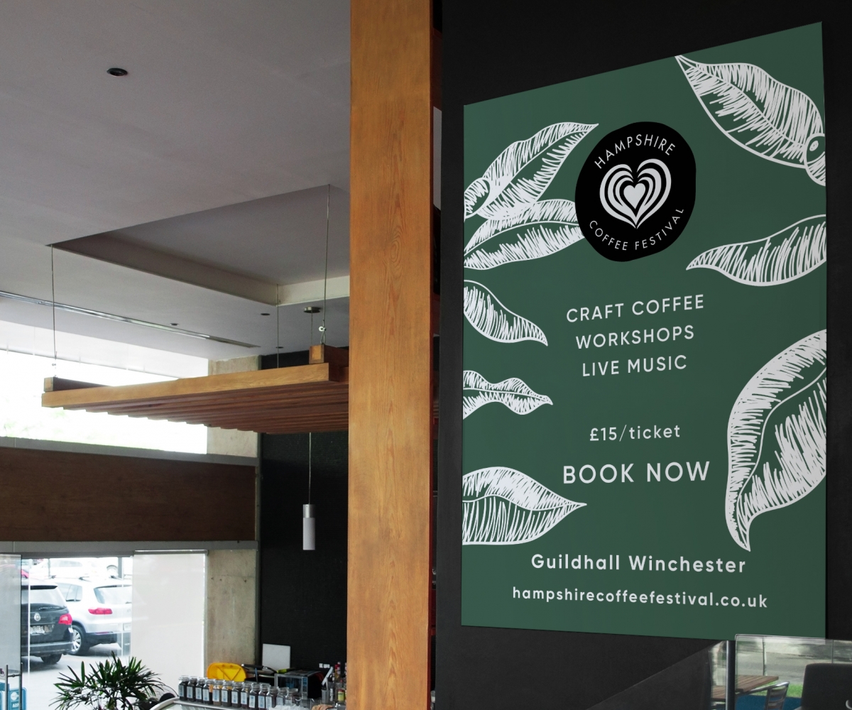
I wanted to create some unique branding for the regions first coffee festival that was exclusively ‘Hampshire’. Combining a natural earthy palette and a hand drawn illustrative style to create a distinctive new brand. The colours and sketched design helps to bring about a feeling of homeliness, warmth that coffee shops often have. The illustrative style is easy to replicate across different collateral and works well in black and white. The logo again represents this imperfect homely feel with the drawn style circle and latte art heart.


